5 Real Estate Ways The New FB Timeline #Fails My Page & My Fans
 This is the first in a brief series of blog posts in which I will show how the new Facebook timeline leaves a whole lot to be desired - at least in this long-time user's humble opinion!
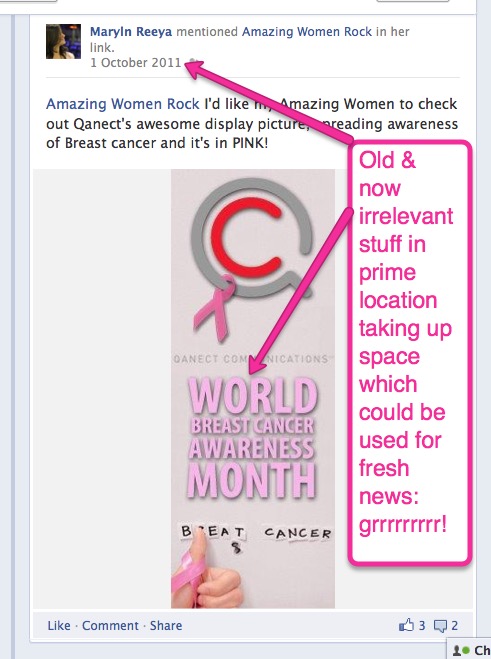
This first post is short on text and long on images. Let the images in the gallery speak for themselves.
BUT, for the written record, in a nutshell: the new timline format has too much prime real estate devoted to content or functionality that is of little or no value to me or my fans/followers.
One wonders how the whole timeline concept even got a foothold at Facebook in the first place when stuff that happened 10 minutes ago is old news already in this day and age. That it is the theme of the new look and functionality is simply astounding...
As bad as this misuse of space is, it's the least of the flaws inherent in the new timeline format, which is pretty much one of the crappiest, least user-friendly designs I have seen in my 25 years as a communications consultant.
 In addition to the issues captured in the images, the design has other flaws the details of which I will discuss in upcoming blog posts.
However, one flaw above all takes the cake: the "See more recent stories" dis-functionality (with reams of ancient history immediately available below it) ranks amongst the top 10 stupidest, most time-wasting, irritating, un-ergonmic, tear-your-hair-out frustrating "features" I've yet to experience on the Internet.
The whole thing makes me question whether any of the timeline design team members have ever actually used a Facebook page. Surely if they had actually tested the design with users and admins they would have trashed this dog's breakfast and come up with something that really works.
In sum: Total. #EPIC. #FAIL. More to follow. Stay tuned.
- Tags: facebook social media technology


